Tuesday, 4 December 2012

Week 10 - Figure Drawing with Tone and Colour in Skin


Figure Drawing with Tone and Colour, One

This is a 40-minute drawing using coloured pastels. The colours within this drawing work really well and blend in well together. A variety of different colours have been used to replicate the colours within the skin. There are very warm colours around the torso areas where the figures posture is very closed and very cold colours around the legs and knees where the figures posture is very open. This creates great detail and tonal value within this drawing and although it wouldn’t be thought that these colours would appears in the skin they work very well together.

There is great detail within the figures knees which sense of force of gravity as it is clear to see the leg on the right is taking a lot of the weight with the position of this leg being a lot lower compared to the leg on the left. There have been a great contrast of colours used around the figures legs and knees, which make them, really stand out with the cold blue colours and the really highlighted areas on the tops of the knees.

The proportions of this figure look relatively accurate apart from the figures head. The body and should seem to be a lot larger in proportion to the figures face and with greater measuring to make this more accurate would have really helped to improve upon this drawing.
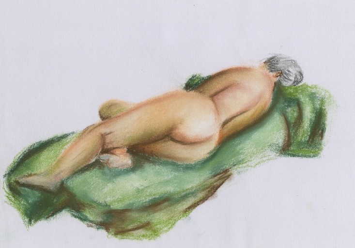

Figure Drawing with Tone and Colour

This is a 30-minute drawing using coloured pastels. The soft use of colours within this drawing really stand out and make the skin on this figure look really smooth as they have been softly blended in to one another. The colours used in this drawing are very warm using a lot of pinks and yellows. With greens and blues used for the colder parts of the drawing. The darkest browns used to create the darkest shadows within the figures body have also been used in the green drapered cloth to help blend these two features together and help with the contrast of colours.

There is a great sense of proportion and foreshortening used in this drawing which really helps to make this drawing stand out as the body is elongated from one side of the page to the other helping the viewers eye to go back and forth from one end of the figures body to the other.

To help improve upon this drawing a background could have been used to have a sense of gravity and not a body floating in mid air. It would also have helped ground this figure in and set a scene to where this drawing has been drawn.

Week 9 - Figure Drawing with Gravity and Drapery on the Human Form


Figure Drawing with Gravity and Drapery, One

This is a 10-minute drawing using a black conte crayon and a white chalk on a pink sugar papered background. There is a sense of strong light, which is shining from behind the figure highlighting strong areas onto the figures face and the clothed drapery. The chalk acts as the highlighter creating great detail within the figures face, which helps pick out the facial features giving this drawing a more emotional feeling as the figures facial expressions appear to be sad.

There is good sense of form within the top half of the drawing however, the proportions for the lower half of the body seem to be a lot smaller than what is naturally there, which creates an unintended focal point. Rather than the viewer looking at the contrast of shadows and highlights the eye is led towards the wrongly measured part of the drawing, which is also sat on a table that doesn’t look quite accurate. The table seems to be leaning to one side and there should have been less table shown where the figure was sitting on it.

With more accurate measuring and a contrast of darker shadows this drawing could have worked very well. There is a good sense of detail within the figures face, which makes this drawing really stand out.


Figure Drawing with Gravity and Drapery, Two

This is a 15-minute drawing using a black conte crayon and a white chalk on a yellow sugar papered background. The proportions of this figure work really well and appear to be really accurate. The hands and feet show good form and is clear to see the direction in which they are facing. The figures legs have been crossed over but cannot be seen as the clothed drapery is covering this however; this can be seen with the twist of the legs pointing the feet in different directions.

The contrast of dark shadows and highlights seem a bit confusing in this drawing. There is good contrast of the figures face, which shows details of the facial features however, the shadows and highlighted areas, seem to get lost within the drapery and is unclear to see where any of form lye’s within this. The shadows and highlights seem to overlap one another with very little middle tonal value. Creating a great contrast from one to the other would have really helped this drawing to stand out. Also creating some shadows within the white sheet the figure is laying on would also help bring the detail out and not make it look like just a really highlighted area within the drawing.


Figure Drawing with Gravity and Drapery, Three

This is a 30-minute drawing using a graphite stick and soft coloured pastels. The main focal point within this drawing is the drapered cloth covering half of the figures body. This is because of the rich contrast of colours, which have been used. Lighter colours have been used for the highlighted areas within this piece of drapery and darker colours have been used to create the shadows created by the folds and overlapping material. The idea behind using coloured pastels with contrast to the graphite stick was to make this drawing stand out more. This drawing does stand out but takes the viewer away from any detail within the figure and leads the eye to where this entire colour is.

More practice is needed to get this style correct as it could be mistaken for simply a big blob of colour that looks like it could be there by accident. The idea was to help blend all these colours together and have great contrast against the grey tonal colours of the figures body. However, the drapery creates too much of a focal point and leads the eye away from what was important in this drawing which was the human figure.

The idea behind this may have worked better with slightly different colours or a different style creating this piece of drapery. There should have been more detail within the figure and less on the piece of drapery, which would have made this drawing work a lot better.


Wednesday, 14 November 2012

Week 8 - Figure Drawing Anatomy Refresher


Anatomy Refresher, One

These are 1.5-minute sketches created from a continuous line drawing. With this drawing the conte crayon never leaves the paper. This very quick style of drawing has a very dynamic feel and shows great flow and fluidity throughout these images. They have a very relaxed feeling towards them as they flow with so many different lines to get the overall shape right with lines filling up some of the blank spaces within these drawings. Many of the lines aren’t correct but these can be improved upon by going over the same lines until it is right.


Anatomy Refresher, Two

This is a 15-minute drawing using a black conte crayon and white chalk on a brown sugar paper background. This drawing has a great sense of depth to it by using the highlighted and darkened areas to pick out the overall shape of the figure. Even though the drawing is not absolutely anatomically correct because of his legs being too short for his body you still get the overall feeling of this drawing.

The white chalk shows the most highlighted areas of light that is cast upon this figure, which contrasts from the very dark shadowing using a black conte crayon. These contrasts of colour create a very dramatic effect that work well with the sugar paper being used as the base colour. The source of light also casts great shadows upon the floor created from the figures body. This plants the figure firmly on the floor creating the sense that he is standing and not floating in mid air.

To improve upon this drawing more measuring could have been done to get the figures body more anatomically correct. With a little sense of a background could also improve upon this drawing without taking away the main focal point.


Anatomy Refresher, Three

This is a 17-minute drawing using a black conte crayon and white chalk on a green sugar paper background. The sugar paper creates a mid tone colour for this drawing with the black creating the shadows and the white creating the highlights. This has a great effect as it shows depth to this image with very little effort.

The light picks up on the twist in the figures body created from the curvature of his spine. Using the black conte crayon to pick out the shadows make possible for the spine to really stand out as the white shows where the spine sticks out and the black where the shadow is cast upon. This creates a very natural, 3d effect as this is what it looks like in real life. The black conte crayon has also been used to pick out the shadows created from the folds within the figures skin to show a very natural positioning of the figures posture.

To improve upon this drawing having some of the back ground lightly sketched in would give the impression of the figure sitting in a room rather than in mid air and would improve upon the overall appearance of this drawing.

Week 7 - Still Life Various Materials


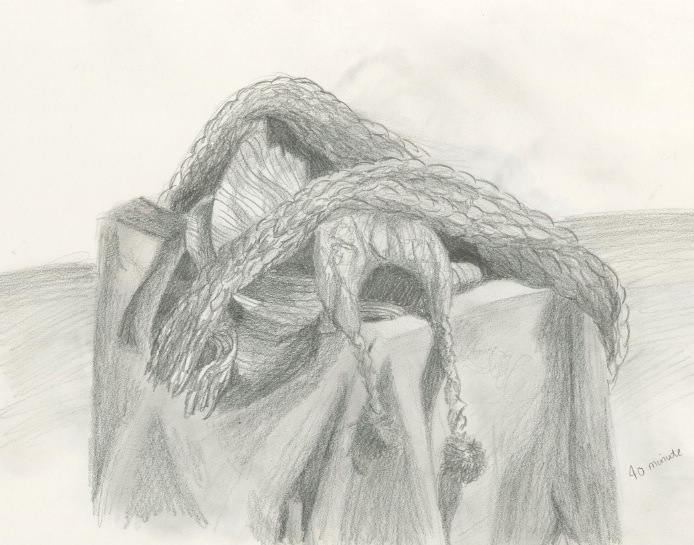
Still Life using Various Materials

This is 40-minute sketch drawn from several different types of clothing and clothe. The contrast of shading really shows through the textures created from the different materials creating the illusion that all these different pieces of clothing have different material properties.

The light source in this image has created a depth in this drawing, which shows how the textures of the materials differ from one another. The texture of the scarf shows a deep bobbly effect. Where as the material of some of the other cloth has no depth at all creating a smooth, less detailed surface.

The thicker the material the darker the shading becomes. This is because the material is trapping the light forcing it to stay where it lands rather than seeping through to create further shadows. The contrast of light and dark create the detail within the image giving the illusion of the materials, which are used in this drawing. The light is cast upon the right side of the drawing casting shadows over to the left creating the sense of depth.

There is a lot of detail in this image, which goes into creating the overall feel and depth of this drawing. Spending more time on this drawing would mean greater detail, which would improve upon the look of the materials used in this drawing.

Friday, 2 November 2012

Week 6 -Still Life (Excursion to Bradford Industrial Museum)


Still Life - Man made Vehicle

This is a long studied drawing of a man made vehicle-using pencil. This drawing has been created with a shortfortening perspective. With this angle it makes a very pleasing and interesting perspective because it is more true to life, as you would usually look at something from this type of an angle rather than from front or side on.

The shininess of this vehicle is shown using a putty rubber to pick out the most highlighted areas of this car. This also gives the feeling of curvature within this vehicle as the shininess shows the form as well as the material used. 

I feel as though this car works best without a background so that the viewer can purely concentrate on the form of the car and not be distracted by any thing in the background.

To improve upon this drawing I would slightly alter the shape of the car as I feel it is not quite accurate. I feel as though the front of the bonnet of the car should have been slightly longer and the left hand side of the car seems to stick out a little too much. 

Week 5 - Still Life Reflections


Still Life Reflections, One

This is a 25-minute sketch using soft coloured pastels on a blue coloured piece of sugar paper. Using the sugar paper as the background to my drawing creates the neutral tones within my drawing making the pastel colours really stand out. The blue paper creates shadows next to the white bones of the skeleton giving it a three dimensional view.

The main aim in this drawing was to capture the image as it reflected onto the mirrored sheet. The mirrored sheet doesn’t mirror the skeleton and its surroundings exactly but distorts them giving it a very impressionistic view. The image in the mirror becomes slightly blurred with just blocks of colour to capture this.

The coloured paper takes away the labouring of colouring in the background and shading as it acts as a neutral colour to add highlights and shadows to my drawing. Using a white pastel to pick out the lightest colours gives a very naturalistic effect as I can use the white to fill in the bones of the skeleton but also use slightly darker colours to capture the shading within these bones without losing the any of the tonal value.

This is a great depiction of the human skeleton and using the coloured sugar paper really makes the pastel colours really stand out. Adding some reflection to the mirrored card the skeleton in lying upon would have really improved this drawing, as it would have really emphasized on the reflection that the skeleton bones create.


Still Life Reflections, Two

This is a 25-minute sketch using graphite pencils from a foreshortening angle. Using a graphite stick makes it possible to pick out all the little details, as the nib of the pencil is quite small. The darkest parts of the drawing have been shaded and smudged to create a smooth look and the lightest parts; like the skeleton bones have been highlighted using a putty rubber.

From this angle it shows the skeleton in a foreshortening view making the accuracy of the skeleton more difficult to capture. It captures the skeleton from the bottom looking upwards.  This makes the rib cage look really large and the biggest part of the body. Using the graphite pencils I was able to pick out all the detail within the rib cage including the individual ribs and also the spine of the skeleton.

There is an implied line within this drawing starting from the curved mirror card to the left of the skeleton, which follows round the side of the table. This leads the eye right around this drawing as it frames the skeleton perfectly.

If I were to improve upon this drawing I would add in a little more detail to the bones by adding in some shading. However, I would have to be careful not to make them to dark, as this would take away the natural whiteness of the bones.


Still Life Reflections, Three

 This is a 25-minute sketch using a black conte crayon. Using the conte crayon makes it possible to create very dark shadows, which have been used for the background where the mirrored card has reflected the interior surroundings. Smudging the conte crayon creates smooth tonal values, which can be scene around the skeletons skull and jaw area. This creates really nice, detailed effects.

The black from the white really make the skull and bones of the skeleton really stand out as the contrast of colours are so different. The mirrored card shows the distortion reflection of the skeleton from underneath creating a very impressionistic view.

There is an implied line that goes around the edge of the table and follows the mirrored card upwards in a curved position. This frames the skeleton as the main focal point of the drawing making it really stand out.


Week 4 - Handling Complex Info (Chesham B Roof)


Handling Complex Info - Chesham B Roof, One

This is a quick 5-minute drawing using a black conte crayon. In this drawing I was able to pick out the really dark shaded areas of this image using the crayon and to create the high lighted areas I either left the space blank or went over it very lightly with the crayon.

The rain really helps bring out the tonal shades within this drawing and makes the shaded areas very solid and black making this impressionistic drawing very dark and dull depicting the image of Bradford perfectly.

The focal points within this drawing are the tall towers that over shadow the buildings and hills of Bradford. The main focal point would be the very large tower, which sits towards the left hand side of the drawing.  There is also an implied line, which takes your eye from the top left hand corner straight across to the bottom right making this a very pleasing and impressionistic drawing.


Handling Complex Info - Chesham B Roof, Two

This is another drawing using a black conte crayon from a different perspective view. The main focal point of this drawing is the hill tops where the sun is shining down on them creating great highlights which really stand out from the rest of the dark shaded image.

There is a great contrast of tonal values within this drawing, which depict a very dark, gloomy day. The dark clouds reflect back down onto the hills and where there is a break in the sky the sun is able to shine down creating great highlighted areas. The tower within this drawing stops this drawing from looking very flat and adds a bit of interest to the image because it is set much higher than the tops of the hills making it break out into the sky.


Handling Complex Info - Chesham B Roof, Three

This is another quick 5-minute drawing using a conte crayon from a different perspective view. The eye is immediately drawn to the darkest parts of this drawing, which consist of the blurriness of the trees and buildings as these have been created in an impressionistic way and the edge of the building that creeps out into the rest of the image. These two complement each other because they give a balance from one side of the drawing to the other.

There is also an implied line, which sits just above the horizon line where the top of the building and the top of the tall tower in the distance meet. These two building sit at the same height which is pleasing to the eye because it makes you constantly keep looking from one building to the other.