Figure Drawing with Gravity and Drapery, One
This is a 10-minute
drawing using a black conte crayon and a white chalk on a pink sugar papered
background. There is a sense of strong light, which is shining from behind the
figure highlighting strong areas onto the figures face and the clothed drapery.
The chalk acts as the highlighter creating great detail within the figures
face, which helps pick out the facial features giving this drawing a more
emotional feeling as the figures facial expressions appear to be sad.
There is good sense of
form within the top half of the drawing however, the proportions for the lower
half of the body seem to be a lot smaller than what is naturally there, which
creates an unintended focal point. Rather than the viewer looking at the
contrast of shadows and highlights the eye is led towards the wrongly measured
part of the drawing, which is also sat on a table that doesn’t look quite
accurate. The table seems to be leaning to one side and there should have been
less table shown where the figure was sitting on it.
With more accurate
measuring and a contrast of darker shadows this drawing could have worked very
well. There is a good sense of detail within the figures face, which makes this
drawing really stand out.
Figure Drawing with Gravity and Drapery, Two
This is a 15-minute
drawing using a black conte crayon and a white chalk on a yellow sugar papered
background. The proportions of this figure work really well and appear to be
really accurate. The hands and feet show good form and is clear to see the
direction in which they are facing. The figures legs have been crossed over but
cannot be seen as the clothed drapery is covering this however; this can be
seen with the twist of the legs pointing the feet in different directions.
The contrast of dark
shadows and highlights seem a bit confusing in this drawing. There is good
contrast of the figures face, which shows details of the facial features
however, the shadows and highlighted areas, seem to get lost within the drapery
and is unclear to see where any of form lye’s within this. The shadows and
highlights seem to overlap one another with very little middle tonal value.
Creating a great contrast from one to the other would have really helped this
drawing to stand out. Also creating some shadows within the white sheet the
figure is laying on would also help bring the detail out and not make it look
like just a really highlighted area within the drawing.
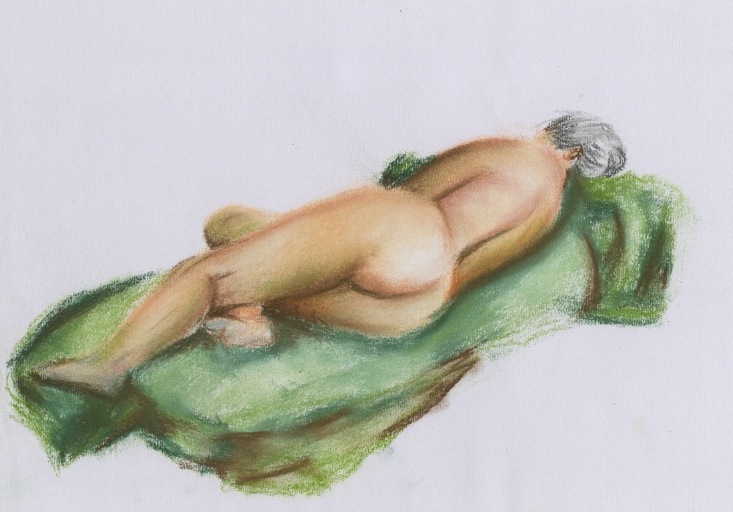
Figure Drawing with Gravity and Drapery, Three
This is a 30-minute
drawing using a graphite stick and soft coloured pastels. The main focal point
within this drawing is the drapered cloth covering half of the figures body.
This is because of the rich contrast of colours, which have been used. Lighter
colours have been used for the highlighted areas within this piece of drapery
and darker colours have been used to create the shadows created by the folds
and overlapping material. The idea behind using coloured pastels with contrast
to the graphite stick was to make this drawing stand out more. This drawing
does stand out but takes the viewer away from any detail within the figure and
leads the eye to where this entire colour is.
More practice is
needed to get this style correct as it could be mistaken for simply a big blob
of colour that looks like it could be there by accident. The idea was to help
blend all these colours together and have great contrast against the grey tonal
colours of the figures body. However, the drapery creates too much of a focal
point and leads the eye away from what was important in this drawing which was
the human figure.
The idea behind this
may have worked better with slightly different colours or a different style
creating this piece of drapery. There should have been more detail within the
figure and less on the piece of drapery, which would have made this drawing
work a lot better.