Figure Drawing with Tone and Colour, One
This is a 40-minute
drawing using coloured pastels. The colours within this drawing work really
well and blend in well together. A variety of different colours have been used
to replicate the colours within the skin. There are very warm colours around
the torso areas where the figures posture is very closed and very cold colours
around the legs and knees where the figures posture is very open. This creates
great detail and tonal value within this drawing and although it wouldn’t be
thought that these colours would appears in the skin they work very well
together.
There is great detail
within the figures knees which sense of force of gravity as it is clear to see
the leg on the right is taking a lot of the weight with the position of this
leg being a lot lower compared to the leg on the left. There have been a great
contrast of colours used around the figures legs and knees, which make them,
really stand out with the cold blue colours and the really highlighted areas on
the tops of the knees.
The proportions of
this figure look relatively accurate apart from the figures head. The body and
should seem to be a lot larger in proportion to the figures face and with
greater measuring to make this more accurate would have really helped to
improve upon this drawing.
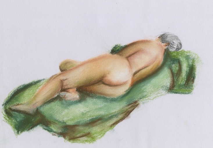
Figure Drawing with Tone and Colour
This is a 30-minute
drawing using coloured pastels. The soft use of colours within this drawing
really stand out and make the skin on this figure look really smooth as they
have been softly blended in to one another. The colours used in this drawing
are very warm using a lot of pinks and yellows. With greens and blues used for
the colder parts of the drawing. The darkest browns used to create the darkest
shadows within the figures body have also been used in the green drapered cloth
to help blend these two features together and help with the contrast of
colours.
There is a great sense
of proportion and foreshortening used in this drawing which really helps to
make this drawing stand out as the body is elongated from one side of the page
to the other helping the viewers eye to go back and forth from one end of the
figures body to the other.
To help improve upon
this drawing a background could have been used to have a sense of gravity and
not a body floating in mid air. It would also have helped ground this figure in
and set a scene to where this drawing has been drawn.